REDESIGN
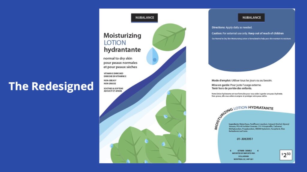
For this project, my assignment is to redesign a whole product of a specific brand. As for my chosen brand is NUBALANCE for their lotions. Hence my rationale of this project;
“Why it’s a better design. Improvement on the text by simplifying it make it less wordy for easier readability. One correction in the French translation to give a more accurate information for the French speakers. Added vectors to give an illusion of a view from above. Looking down at the river as it makes it more visually pleasing. But by also giving it two blue blobs of different shades to make it stand out. As the original doesn’t stand out as much in terms of visual designs. The designs principles used are proportion, negative space, unity & contrast.”
At the start of this assignment, I experienced a lot of creative hesitation. I was genuinely unsure about how to approach the rebranding process. However, I began tackling the problem one step at a time. I systematically sketched out my initial layout ideas on paper. After that step, I regularly conversed with my professor to receive valuable feedback. We discussed what elements I should expand upon in the final version. We also identified which parts I needed to remove later on to better fit the strict criteria of the client. This collaborative process helped me refine my concepts. It pushed me to think critically about consumer packaging and modern visual hierarchy. In the end, the rigorous sketching phase allowed me to transform my doubts into a confident, professional design solution. This project truly taught me how to balance artistic expression with real-world marketing requirements.