CHRISTMAS CARD
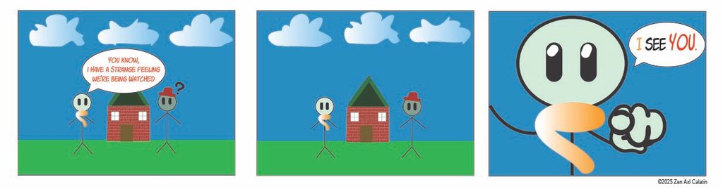
This challenging creative project had me completely slumped at first. I originally had way too many complex ideas that I wanted to implement into a single holiday greeting. Ultimately, my initial concepts proved far too ambitious for the time frame. Because of that hurdle, I resorted to a much simpler and cleaner design idea. I began my workflow in Illustrator by using basic geometric shapes. I constructed a charming house using simple squares, large triangles, and thin lines to resemble the window frames.
As for the texture of the house, I utilized Illustrator’s built-in vector texture options. I chose a classic brick pattern to create a cozy, realistic brick house layout. Next, I proceeded to create two minimal stickmen characters. I gave each character one unique accessory to better differentiate who was who on the paper. The specific stickman wearing the gradient scarf was designed to speak directly with a vector speech bubble. This character refers openly to the actual reader looking at the physical card. I added this element as a clever play of artistic self-awareness.
By the time I finished constructing the digital artwork, I placed a transparent PNG image of a pointing hand to direct the reader’s eyes. Once the digital file looked perfect, I finally printed the design out on heavy cardstock. I carefully folded the paper three times to resemble a traditional, professional Christmas card structure. This hands-on project taught me a lot about the value of simplifying complex ideas. It also showed me how a clever layout can engage an audience perfectly. I am incredibly happy with how this unique, self-aware holiday design turned out in the end.